Components
Every Tier 1 component, rendered from the same generated tokens as the rest of the site — change the source color and this page moves with it. Each carries the version of the contract it implements, read from the contract file at build time rather than typed here.
Foundation — the dependency the waves build on
One primary action per group — a Card or Dialog footer refuses a second, and destructive work takes danger rather than primary.
asChild renders the button onto its child, so a link can be button-shaped without a button wrapping an anchor. Sizes run sm to lg, plus a square icon size whose accessible name still has to be given.
Wave 1 — Zero-dependency primitives
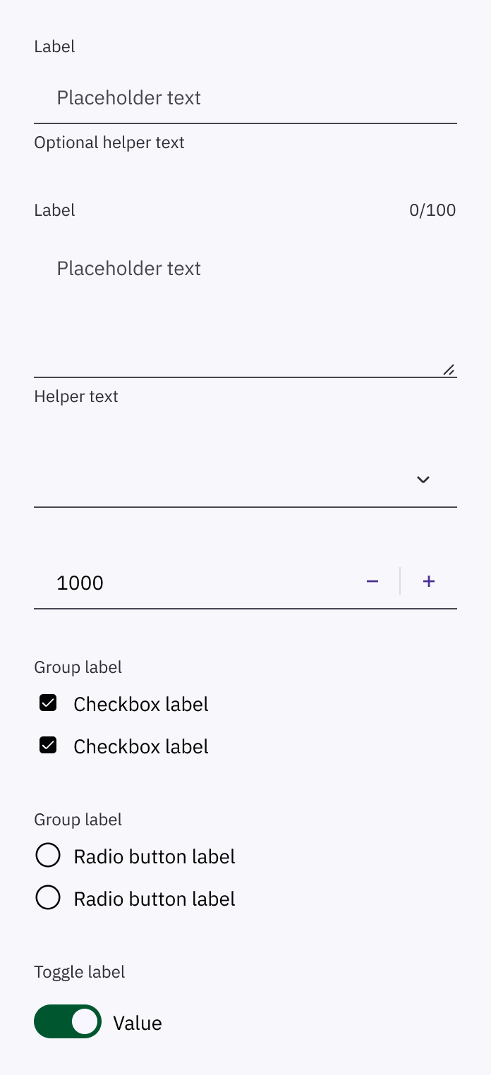
Always bound to exactly one control; Field is what normally supplies the pairing.
Content above the rule.
Content below it.
Structural only — it carries no margin, because spacing belongs to the layout that places it.
Heading three
Body text sits at the default variant.
Caption
imageThe broken image swatch points at an unreadable source: failure falls back to initials, never a broken icon or an empty circle.
Numeric badges cap rather than overflow; the true value stays in the accessible name.
Wave 2 — Form atoms
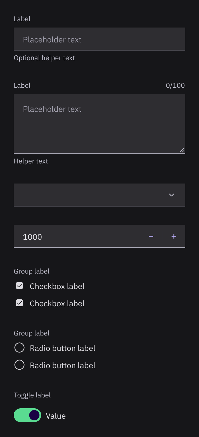
Indeterminate is a distinct glyph, not a recolored check.
A group legend is required; option labels alone are not enough.
Labels name the setting, never the state.
A native select, so type-ahead and arrow keys survive.
Wave 3 — Form composition
Error text forces the child into its error state — the two cannot be shown apart.
Wave 4 — Layout & navigation
Card header
Body content.
Cards never nest; use a Separator to group content inside one.
The row primitive Table composes from — its hover is the same token Table uses.
First panel
Second panel
Inactive panels stay mounted, so form state in a tab survives switching away.
Long trails collapse their middle rather than wrapping; the last crumb is not a link.
Two levels only — a third would be a page, not a deeper flyout.
Wave 5 — Overlays
Supplementary only, and never interactive — a tooltip you can click into is a Popover.
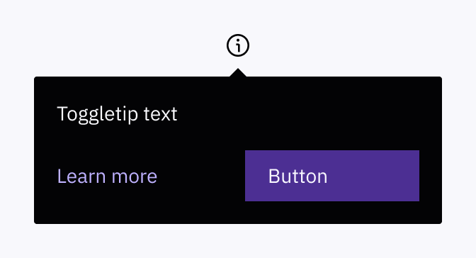
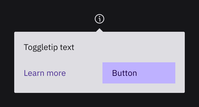
Interactive content is allowed here.
Escape dismisses and focus returns to the trigger, from the shared Overlay base.
Destructive items never read as neutral ones.
Traps focus, returns it to the trigger on close, and never stacks.
Info
Danger
Inline and persistent — not a toast, which is Tier 2 with its own timing contract.
Wave 6 — Data display
Ada | Owner |
Grace | Editor |
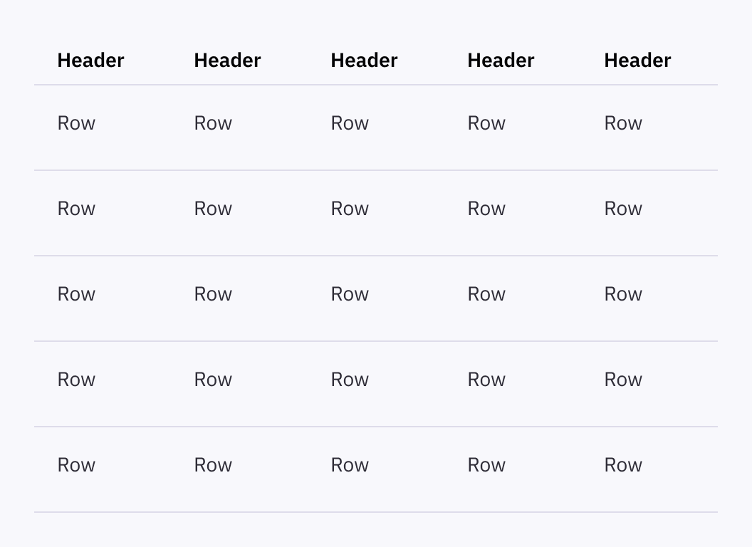
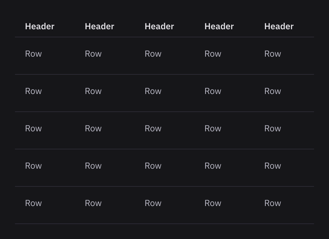
Sticky headers survive scroll, and row hover is Item's token rather than a table-specific highlight.